Streamlit
Streamlit is a data visualization library to assist the python data scientist to present the data in interactive format. It is easy to use. It provides a lot of html component so that you don't need to implement the html control from scratch. Therefore, the developer can focus on the chart format, analysis logic and data source management. In addition, it also provides a free hosting environment to users. Thus, the only thing you need to concern that is upload your source code to GitHub and create the streamlit account and make it connects to your GitHub account. Honestly, not every data scientist is familiar with html or javascript. Therefore, I think this tool can help most of the data scientist, who are not familiar with html, css and javascript. In this article, I introduce the basic component of streamlit and use an example- technical indicator dahsboard for stock to show built-up process step by step.
Preparation
First of all, you have to install the following library before you started.
- Numpy
- Pandas
- Pandas_datareader
- Pands_ta
- Plotly
- Streamlit
- Yfinance
I also put all the above dependencies into requirement.txt file.
Data
All the stock price data used in this dashboard is download through yahoo finance API. Fortunately, there is a yfinance library in python, which has implemented the interface already. Therefore, you don’t need to study the yahoo finance API. And the result is get by the below code.

You pass the stock symbol, start and end datetime object to this function. It returns a dataframe object, and the dataframe includes Date, Open, High, Low, Close columns.
Technical Indicators
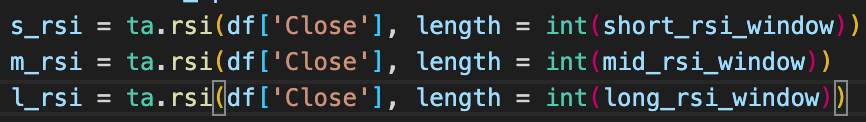
I implements 9 technical indicators in this dashboard. Thanks to the pandas_ta library. You don't need to implement those TA computation process by yourself. All you needs to is to invoke the function with correct parameters. I extracts the technical indicator function invoking in the following pictures. I think this might help you quickly understand those function invoking. In you want to deeply study the pandas TA, you can go to the official website
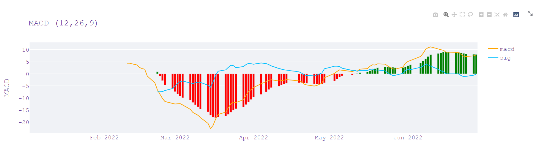
MACD

RSI
MFI

KDJ

Bollinger Bands
![]()
SAR
![]()
Moving Average
![]()
Exponential Moving Average
![]()
Weight Moving Average
![]()
Streamlit components and API
Plotly
Streamlit provides chart component for users to draw the chart. However, I want to be more flexible and easily to interact. Therefore, I use plotly to manipulate the chart. Streamlit provides a function for users to integrate the plotly graphic object with its chart component. The function is plot_chart. You can invoke this function by pass the following format.
![]()
Streamlit components
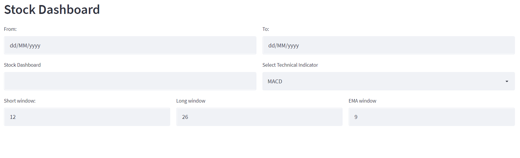
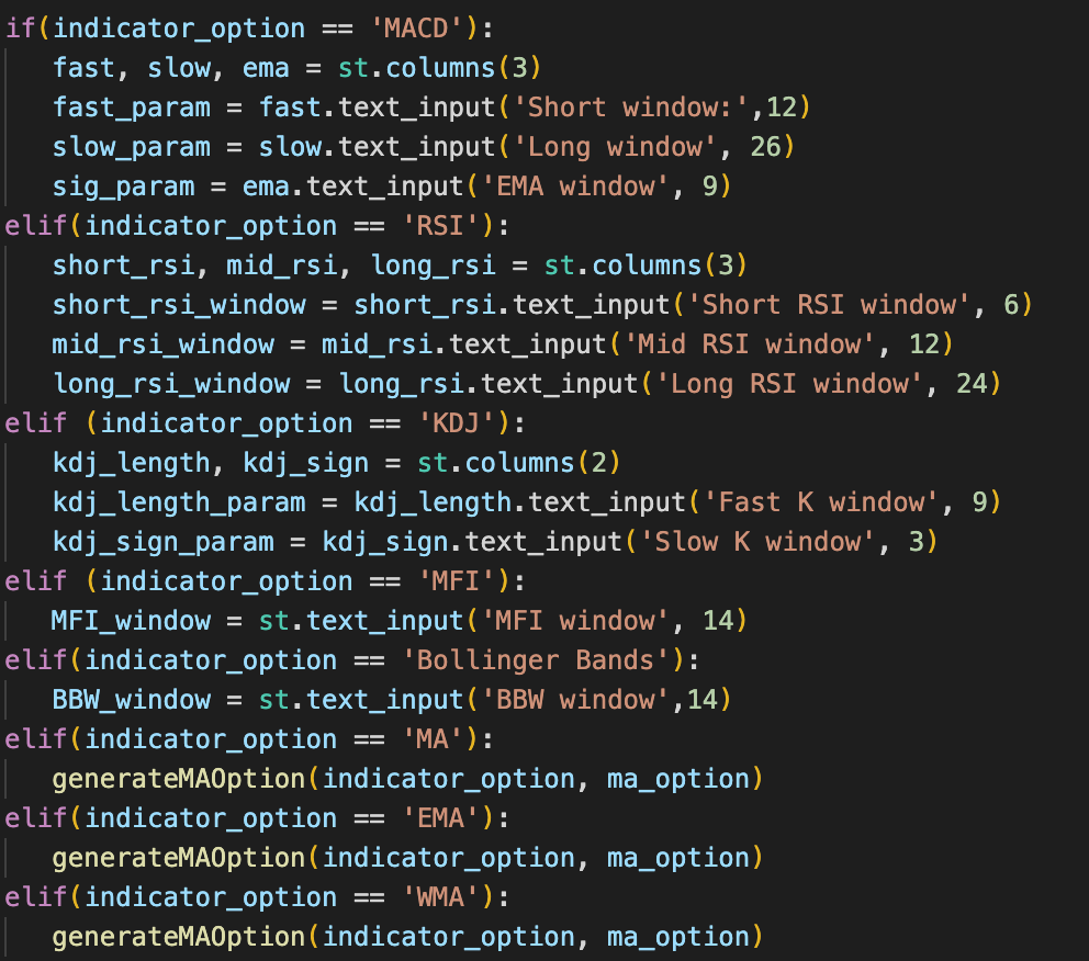
In this dashboard, I provide different components to users to input the needed parameters. For the start date, end date symbol, and window parameter, They are text input controls. In addition, I implement start date and validation logic so that the data loading will trigger only when the user enter the correct date format.
Text input
![]()
Date input

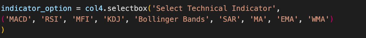
For technical indicators, I use select box component for users to select the provided technical indicator in this dashboard.
Selectbox
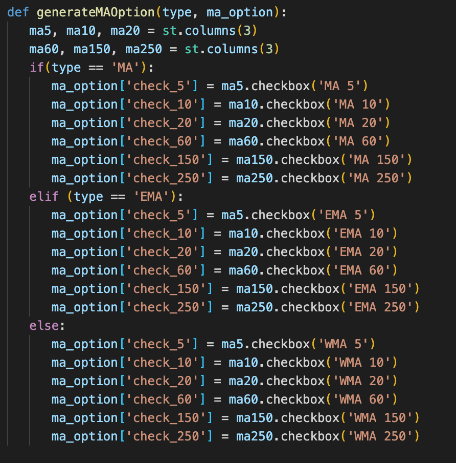
For the moving average indicator, the investor always compares the moving average by different sliding window. Therefore, I provide a checkbox component in the dashboard for user to select their own favorite sliding window.
Checkbox
![]()
Another advantages of streamlit that is responsive design. If you have website development experience, you will know the responsive design is implemented by the custom css code or framework like bootstrap or foundation. But streamlit is more easily. You don't need to implement your custom css or include other frameworks to make the responsive layout. I provides a container and column api for you to build the dashboard layout with responsive design supported. In this application, I use the st.column to build the input control of parameters.

Application
In this part, I show you the whole application logic and explain some code logic. At the beginning, the following picture is the finished application.
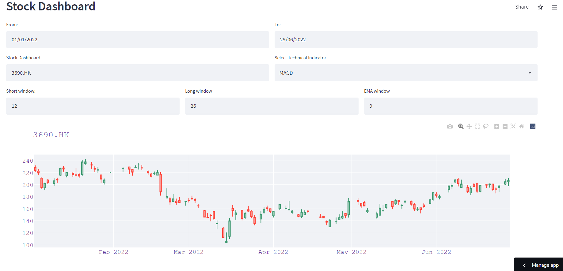
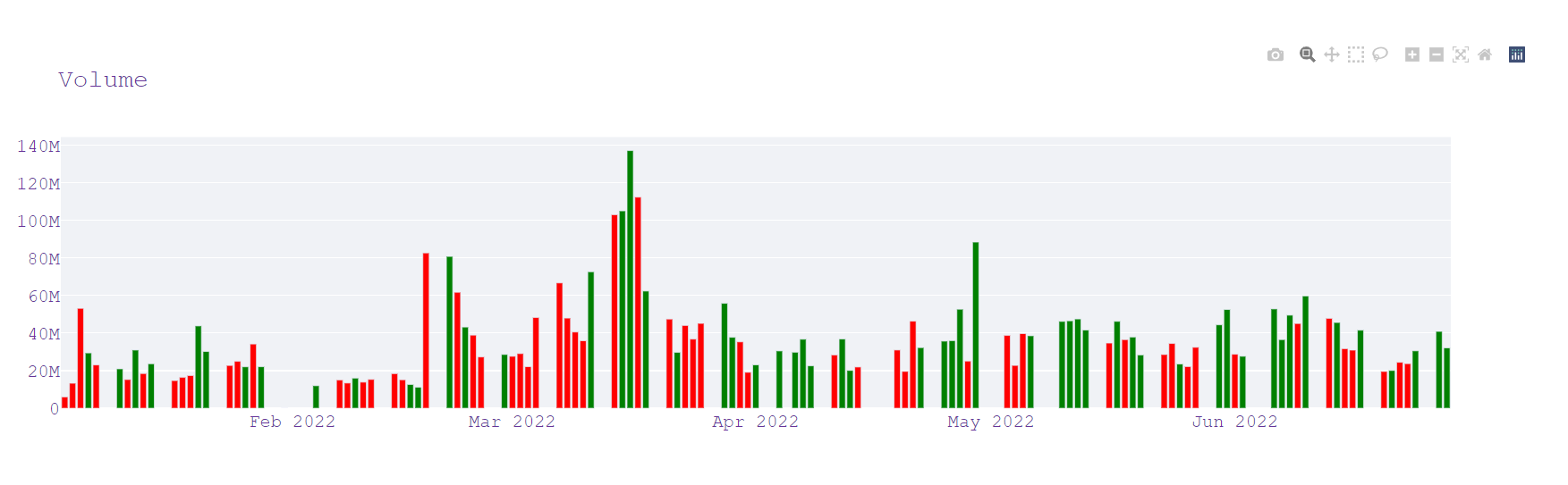
 Usually, the dashboard displays the price chart and volume chart no matter what technical indicators you selected. And the chart for selected technical indictor will be displayed at the bottom of the dashboard. The below code shows you the parameter input control will be displayed based on which technical indicators the use selected.
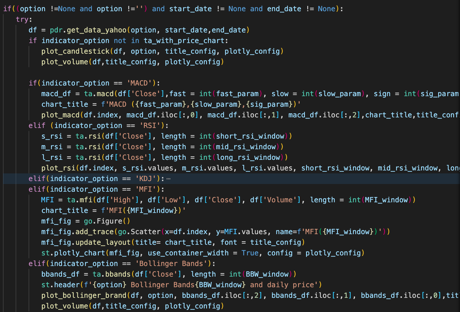
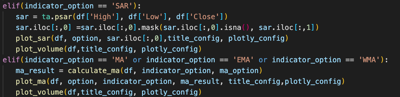
Once the parameters are ready, the dashboard will download the stock data from yahoo finance, calculate the technical indicator value and display charts respectively.
The full source code you can download from my GitHub. As for the dashboard, you can try it on my streamlit app page
Once you complete the code or clone from my GitHub, you can enter "streamlit run main.py" command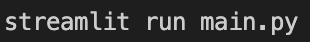 to run the dashboard in your personal computer.
Summary
In this article, I introduce the basic usage of streamlit library. It is very powerful, simply to use and free for you to create your own data dashboard. I also briefly introduce the pandas-ta library, which can compute the stock technical indicator value and integrated to pandas library. Therefore you don't need to implement the computation logic by yourself in python. Finally, I show you how to create the technical indicator dashboard, I use some basic streamlit component and API such as plot_chart, text_input, selectbox, checkbox and column to build it. As always, I hope you enjoy this article!
Please leave your email below.